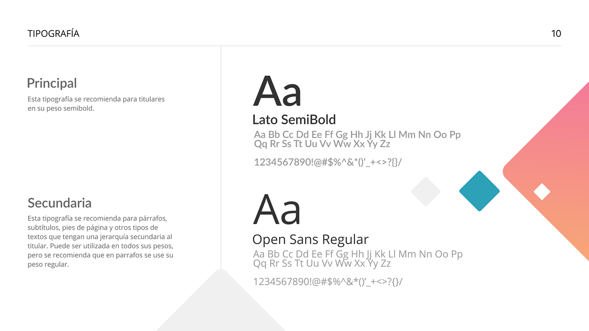
I collaborated with Flip Tools on a full refresh of their visual identity, starting with a redesigned logo and a comprehensive Brand Guidelines Manual that the company continues to use today. The goal was to simplify the brand, strengthen its technological character, and ensure the logo worked effectively across a wide range of formats.
The project involved updating the primary orange color, creating a compact symbol, and adding a tagline that communicates Flip Tools’ core value: training frontline workers without the need for computers or internet. I also defined a supporting color palette, photography guidelines, and graphic elements to streamline the creation of consistent visual materials.
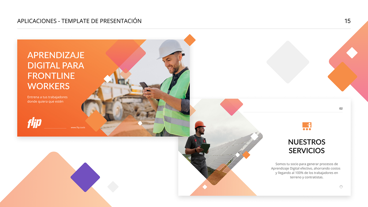
To conclude, I developed design examples demonstrating how the new identity adapts across different communication pieces while maintaining coherence and visual clarity.